In the realm of digital photography, Adobe Lightroom stands as a powerhouse for photo editing, offering a myriad of tools to enhance and transform your images. Among its many features, color grading takes a prominent role, allowing photographers to infuse their shots with a captivating blend of hues and achieve a harmonious balance. In this article, we’ll delve into the intricacies of Lightroom color grading, exploring the art of blending and achieving balance for stunning visual results.
Understanding Color Grading in Lightroom
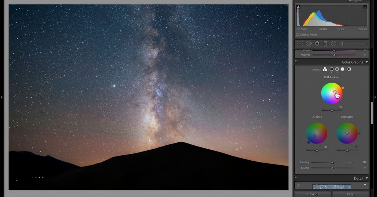
Color grading in Lightroom involves the adjustment of color tones in an image to evoke a desired mood or style. The process encompasses three primary elements: Highlights, Shadows, and Midtones.
Highlights:
- Adjusting the hue, saturation, and luminance of the brightest parts of your image.
- Creates a focal point and enhances specific elements.
Shadows:
- Manipulating the darker areas to add depth and dimension.
- Balancing shadows prevents the image from looking too flat.
Midtones:
- Fine-tuning the tones between highlights and shadows for overall color harmony.
- Essential for achieving a balanced and well-blended look.
Blending Techniques for Seamless Transitions
Graduated Filters:
- Apply gradual changes to color and exposure.
- Ideal for balancing a bright sky with a darker foreground.
Radial Filters:
- Create circular adjustments to emphasize or de-emphasize specific areas.
- Useful for drawing attention to a subject or adding a vignette effect.
Adjustment Brushes:
- Paint specific color adjustments onto targeted areas.
- Perfect for intricate adjustments and localized color enhancements.
Maintaining Balance for Aesthetic Appeal
White Balance:
- Set the overall color temperature for a natural look.
- Adjust tint to control the balance between green and magenta tones.
Tone Curve:
- Fine-tune the luminosity of different tonal ranges.
- Essential for achieving a balanced and visually appealing contrast.
Split Toning:
- Infuse your image with subtle color tones in highlights and shadows.
- Adds warmth or coolness for artistic expression.
FAQs
What is the difference between color grading and color correction in Lightroom?
Color correction aims to fix color issues like white balance, while color grading focuses on enhancing and stylizing the overall look of an image.
How can I achieve a natural-looking color balance in my photos?
Start by setting the correct white balance, use the Tone Curve for balanced contrast, and fine-tune individual color tones with the HSL/Color panel.
Can I undo color grading changes in Lightroom?
Yes, Lightroom provides a non-destructive editing environment. You can revert to the original state or step backward through your editing history.
Are there any presets available for quick color grading in Lightroom?
Yes, Lightroom offers various presets that serve as starting points for color grading. You can use them as-is or customize them to suit your preferences.
Conclusion
Mastering color grading in Lightroom involves a delicate dance of blending and balance. By understanding the tools and techniques available, photographers can breathe life into their images, creating visual masterpieces that resonate with their unique style. Experimentation is key, so don’t be afraid to explore the vast possibilities that Lightroom offers for color grading.
This page was last edited on 27 February 2024, at 10:14 am