Web design is an ever-evolving field, and one of the latest trends gaining traction is image masking using CSS. This image editing inspired technique allows designers to create stunning visual effects, giving a new dimension to web content. In this comprehensive guide, we’ll delve into the world of image masking in CSS, explaining what it is, how it works, and how you can implement it to enhance your website’s visual appeal.
What is Image Masking in CSS?
Image masking in CSS is a technique that enables you to apply a mask to an element’s content, revealing only a portion of it while hiding the rest. It’s a powerful way to create visually striking effects and emphasize specific parts of an image.
CSS Properties for Image Masking
To implement image masking, you can use the following CSS properties:
mask-image: Specifies the image to be used as a mask.mask-mode: Determines how the mask image is applied.mask-size: Sets the size of the mask image.mask-position: Defines the position of the mask image.mask-repeat: Specifies how the mask image repeats.
Different Types of Image Masks
There are various types of image masks you can apply in CSS:
- Alpha Masks: Use grayscale images to create transparent areas on the element.
- Luminance Masks: Control visibility based on the brightness of the mask image.
- SVG Masks: Use Scalable Vector Graphics (SVG) for intricate and custom shapes.
Implementing Image Masking in CSS
To implement image masking in CSS, follow these steps:
- Create an HTML element that you want to apply the mask to.
- Define a mask using the
mask-imageproperty, specifying the path to your mask image. - Customize the mask properties (e.g.,
mask-size,mask-mode,mask-position) to achieve the desired effect.
Here’s a simple example of how you can apply an image mask in CSS:
.masked-element {
  mask-image: url('mask.png');
  mask-mode: alpha;
  mask-size: cover;
  mask-position: center;
  mask-repeat: no-repeat;
}
Use Cases and Benefits of Image Masking
Image masking in CSS offers a range of benefits and can be used in various creative ways:
- Hover Effects: Apply masks for intriguing hover effects, like revealing hidden content.
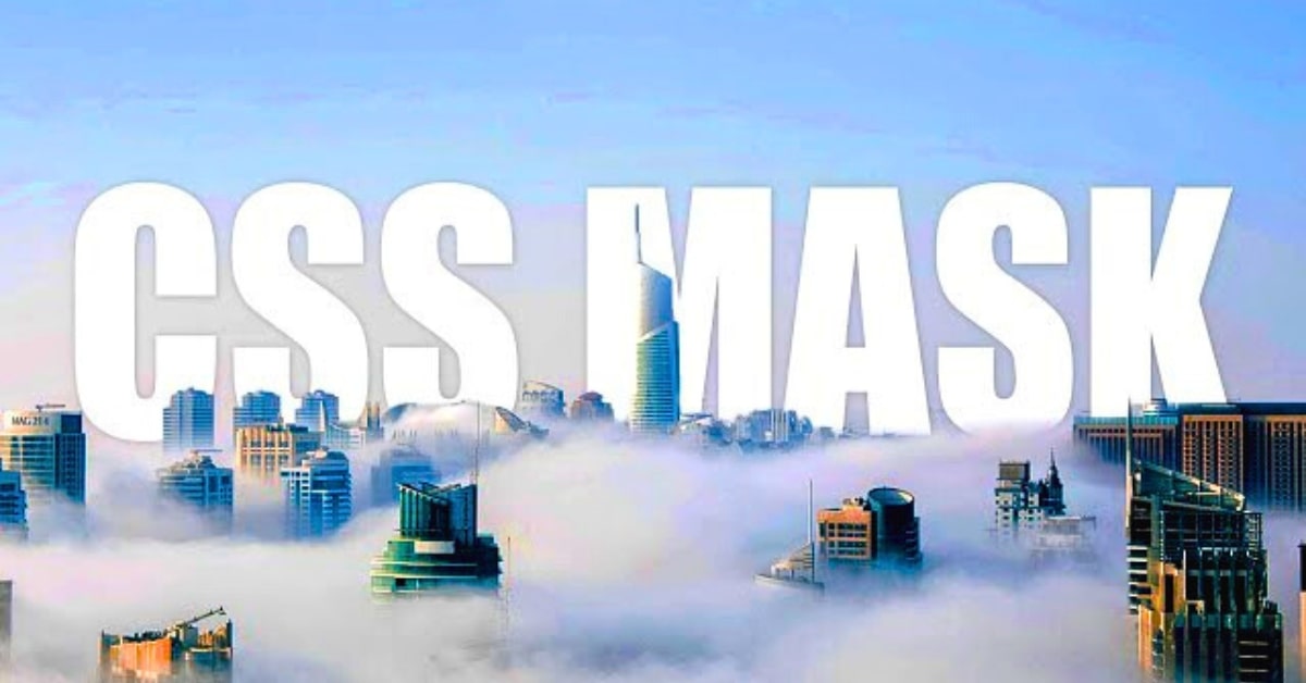
- Typography: Use text as masks to create artistic text-based designs.
- Image Galleries: Apply masks to image thumbnails for unique gallery layouts.
- Custom Shapes: Create custom shapes or cutouts for images and elements.
The benefits of using image masking in CSS include improved user engagement, enhanced visual appeal, and the ability to create unique and eye-catching designs.
Conclusion
Image masking in CSS opens up a world of creative possibilities for web designers. By understanding the CSS properties and types of masks available, you can create unique and visually captivating designs that enhance the user experience on your website. Experiment with image masking to add that extra touch of magic to your web projects and leave a lasting impression on your visitors.
FAQs
Can I use image masking in CSS for responsive designs?
Yes, image masking can be used for responsive designs by adjusting mask properties such as size and position based on different screen sizes.
What types of images are suitable for creating masks?
Grayscale images with good contrast work well for alpha masks, while luminance masks can use images with varying brightness levels. SVG masks are versatile and allow for intricate shapes.
Are there any browser compatibility issues with image masking in CSS?
While most modern browsers support image masking in CSS, it’s important to test and ensure compatibility with older browser versions.
Can I apply multiple masks to the same element?
Yes, you can apply multiple masks to an element and control their order and visibility using mask properties.
Are there online resources or tools for creating mask images?
Yes, you can find a variety of online resources and tools for creating mask images, including image editors and libraries with mask templates.
This page was last edited on 22 February 2024, at 11:04 am