In the ever-evolving world of web design, aesthetics play a crucial role in capturing the user’s attention. One of the key elements in creating visually appealing designs is the use of drop shadows. These shadows add depth and dimension to elements, making them stand out and come to life on your web page. If you’ve heard the term “drop shadow SVG” but aren’t quite sure what it entails, you’ve come to the right place. In this comprehensive guide, we’ll delve into the world of drop shadow SVGs, explaining what they are, how to create them, and why they matter in web design.
What Is a Drop Shadow in SVG?
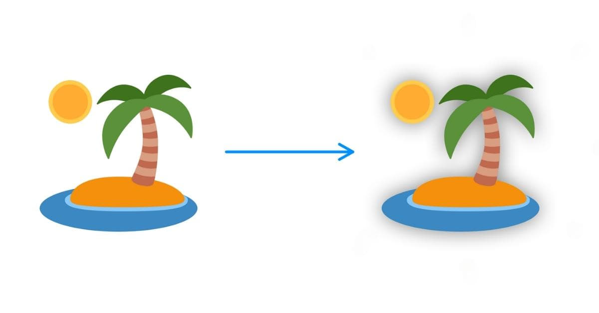
A drop shadow in SVG is a graphical effect applied to an element, giving it the appearance of casting a shadow. This effect can create a sense of depth, separation from the background, and emphasis, enhancing the overall aesthetics of your web design.
How Do Drop Shadows Work in SVG?
Drop shadows are created by adding an extra layer of graphics behind the element you want to shadow. This shadow layer is a semi-transparent shape that mimics the form of the object casting the shadow. By controlling the blur, color, and position of this shadow layer, you can achieve various drop shadow effects.
Creating Drop Shadows in SVG
Creating a drop shadow SVG is a straightforward process. You can either design one from scratch or use various design tools available online. Here’s a simplified step-by-step guide:
Manual Drop Shadow Creation
To create a drop shadow manually in SVG, you can use the <filter> element. This element allows you to define the shadow properties, such as feGaussianBlur for blur, feOffset for positioning, and feFlood for color.
Here’s a basic example of a drop shadow filter in SVG:
<filter id="drop-shadow" x="-20%" y="-20%" width="140%" height="140%">
  <feGaussianBlur in="SourceAlpha" stdDeviation="5" />
  <feOffset dx="0" dy="0" result="offsetblur" />
  <feFlood flood-color="#000" result="color" />
  <feComposite in2="offsetblur" operator="in" />
  <feComposite in2="SourceAlpha" operator="in" />
  <feMerge>
    <feMergeNode in="SourceGraphic" />
    <feMergeNode />
  </feMerge>
</filter>
Using CSS for Drop Shadows
You can also create drop shadows in SVG using CSS properties like filter and box-shadow. This method is more accessible and user-friendly, as it doesn’t require writing complex SVG filter code.
.my-element {
  filter: drop-shadow(5px 5px 10px rgba(0, 0, 0, 0.5));
}
Tips for Effective Use
When using drop shadow SVGs, keep these tips in mind:
a. Subtle Shadows: Avoid overly dramatic shadows that can overwhelm your design. Subtle shadows are often more appealing.
b. Consistency: Maintain consistency in shadow style and settings throughout your website for a cohesive design.
c. Performance Optimization: Optimize your SVGs for performance by simplifying paths and minimizing unnecessary details.
d. Accessibility: Ensure your design remains accessible to all users, including those with visual impairments, by providing alternative text for the SVG.
FAQs
Q1: What’s the difference between drop shadow SVG and CSS drop shadow?
Drop shadow SVG is an image format, while CSS drop shadow is a styling effect applied to HTML elements. The key difference is that drop shadow SVG is used for creating and applying a shadow effect to an entire element as an image, while CSS drop shadow applies shadows to elements in the browser using CSS.
Q2: Can I use SVG drop shadows in responsive web design?
Absolutely! SVG images and drop shadows are ideal for responsive web design. They scale well without losing quality and adapt to different screen sizes seamlessly.
Q3: What are the browser compatibility issues for SVG drop shadows?
Most modern browsers support CSS-based drop shadows in SVG. However, for older versions of Internet Explorer, you may need to provide a fallback or alternative styling.
Q4: Can I animate SVG drop shadows?
Yes, you can animate SVG drop shadows using CSS transitions or animations. This adds interactivity and visual appeal to your web designs.
Conclusion
Incorporating drop shadow SVGs into your web design can elevate your visuals to the next level. These scalable, SEO-friendly elements add depth and dimension to your content while maintaining excellent performance and responsiveness. By following our guidelines and best practices, you can create stunning designs that captivate your audience and provide a memorable user experience. So, go ahead, experiment with drop shadow SVGs, and watch your web design flourish!
This page was last edited on 16 January 2024, at 4:55 pm