In the realm of graphic design and image editing, the term “drop shadow” is a common and indispensable concept. It’s a versatile tool that can add depth, dimension, and a touch of realism to your designs. In this article, we’ll explore the drop shadow definition, its applications, and how to create it effectively. By the end of this article, you’ll be well-versed in the art of using drop shadows to enhance your visuals.
Drop Shadow Definition
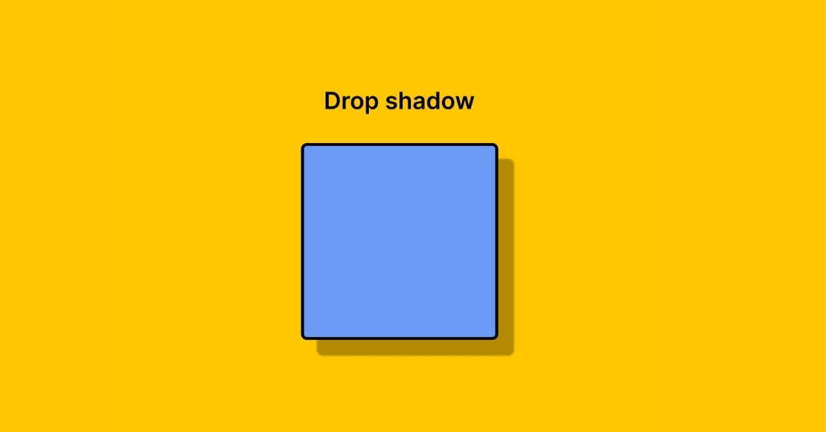
A drop shadow, in graphic design, is a visual effect applied to an object or text to create the illusion of it casting a shadow on the underlying surface or background. This effect mimics the way light interacts with physical objects in the real world, making the design element appear to “pop” off the page or screen. Drop shadows are versatile and can be customized in terms of size, opacity, and angle to achieve the desired visual effect.
Applications of Drop Shadows
- Depth and Realism: Drop shadows add depth and realism to flat objects, making them visually engaging.
- Separation from Background: They help separate the object from the background, especially when the background is similar in color or texture.
- Focus and Emphasis: Drop shadows can be used to draw attention to a specific element in your design.
- Lift and Floating Effect: Objects with drop shadows can appear as if they’re floating above the background, creating an interesting visual dynamic.
- Usability: In user interface (UI) design, drop shadows can be used to simulate the elevation of elements like buttons, cards, and dialog boxes, making them more user-friendly.
Creating Effective Drop Shadows
- Shadow Color: Choose a shadow color that complements your design. Typically, a darker shade of the object’s color works well.
- Opacity: Adjust the opacity of the shadow. A subtle shadow is often more effective than an overly dark one.
- Size: The size of the shadow determines how far the object appears to be lifted from the background. Experiment to find the right balance.
- Angle: The angle of the light source affects the direction of the shadow. Keep it consistent with the overall lighting in your design.
- Blur: Adding a slight blur to the shadow can create a more natural and realistic effect.
- Layer Arrangement: Make sure the shadow is on a separate layer behind the object, allowing for easy adjustments.
- Consistency: Maintain consistency in shadow parameters across your design for a polished look.
FAQs
1. What software can I use to create drop shadows?
You can create drop shadows in popular photo editing software such as Adobe Photoshop, Illustrator, InDesign, and even in user interface design tools like Sketch, Figma, or Adobe XD.
2. Can drop shadows be used in web design?
Yes, drop shadows are commonly used in web design to create depth and improve the user interface’s overall aesthetics.
3. Are there any specific rules for using drop shadows in design?
While there are no strict rules, it’s essential to use drop shadows tastefully. Avoid excessive use, as it can make your design look cluttered. Ensure the shadows align with the lighting in your design for a more realistic effect.
4. How can I make text more readable with drop shadows?
To improve text readability, use drop shadows sparingly. Ensure there’s enough contrast between the text and the background, and make the shadow subtle to avoid distracting from the content.
5. Can drop shadows be applied to images as well?
Certainly! Drop shadows can be applied to both text and images to create a unified and visually appealing design.
Conclusion
Understanding the drop shadow definition and its applications is a valuable skill for graphic designers and digital artists. When used effectively, drop shadows can transform your designs, adding depth, realism, and visual appeal. By following the best practices for creating drop shadows, you’ll be able to elevate your design projects to the next level. So go ahead and experiment with drop shadows to see how they can enhance your creative work.
This page was last edited on 25 February 2024, at 2:26 pm