Color grading in photography is a transformative process that transcends mere correction; it’s a journey toward crafting visually enchanting narratives. Whether you’re a seasoned photographer or an enthusiastic beginner, understanding the principles and techniques of color grading can breathe life into your images. In this comprehensive guide, we will explore the intricacies of color grading in photography, unraveling the magic that turns a good photo into a captivating masterpiece.
What is Color Grading in Photography
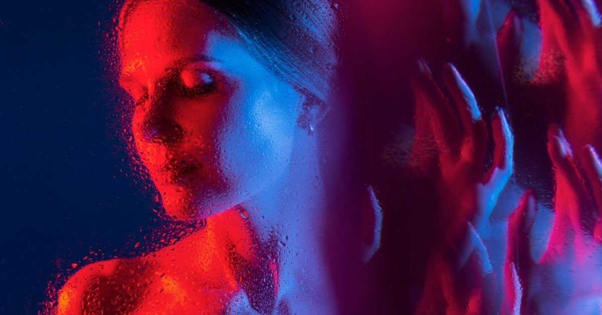
Color grading in photography refers to the creative and intentional adjustment of colors in an image to achieve a specific look or mood. It goes beyond simple color correction, allowing photographers to infuse their work with a unique and personalized visual style.
Key Aspects of Color Grading in Photography
- Hue and Saturation: Adjusting the intensity and vibrancy of colors to evoke specific emotions.
- Contrast Enhancement: Fine-tuning the contrast levels to add depth and visual interest.
- Color Balance: Ensuring a harmonious distribution of colors for a cohesive and appealing composition.
Importance of Color Grading in Photography
- Creative Expression: Color grading provides photographers with a powerful tool for expressing their creative vision and style.
- Storytelling: It enhances the narrative and emotional impact of an image, guiding viewers to interpret the photograph in a specific way.
- Consistent Branding: For professional photographers, color grading becomes a signature element, contributing to a consistent and recognizable visual brand.
Techniques for Effective Color Grading in Photography
- Use of Presets: Utilize pre-made color grading presets or develop your own to achieve specific looks consistently.
- Selective Color Adjustments: Target specific hues or areas in the image for nuanced adjustments, emphasizing or de-emphasizing certain elements.
- Understanding Color Theory: Familiarize yourself with color theory principles to make informed decisions about color combinations and contrasts.
Common Color Grading Styles in Photography
- Warm and Cozy Tones: Achieve a welcoming and nostalgic feel by emphasizing warm hues like oranges and yellows.
- Cool and Moody Aesthetics: Infuse a sense of mystery or drama by leaning towards cooler tones, such as blues and greens.
- High-Contrast Black and White: Elevate the drama in monochrome images by playing with contrasts for a bold and impactful result.
Conclusion
Color grading in photography is a potent tool that empowers photographers to transcend the boundaries of reality and create images that resonate with emotion and style. Dive into the world of color grading, experiment with techniques, and watch as your photographs evolve into captivating visual stories. Remember, the true beauty lies in the artistry of crafting a unique visual narrative that speaks to both the eyes and the soul.
FAQs
Q1: Can color grading fix poorly lit photos?
A: While color grading can improve the overall appearance of a photo, it may have limitations in correcting severe issues caused by poor lighting. It’s essential to address lighting challenges during the initial capture for the best results.
Q2: Is color grading only for professional photographers?
A: No, color grading is for photographers of all levels. Whether you’re a hobbyist or a professional, understanding color grading can enhance your images and bring your creative vision to life.
Q3: Can I achieve effective color grading with basic photo editing software?
A: Yes, basic photo editing software often provides essential tools for color grading. However, more advanced and nuanced color grading can be achieved with professional editing software like Adobe Lightroom or Photoshop.
This page was last edited on 25 February 2024, at 4:36 pm